| Author | Message | ||
Blgg New member Username: Blgg Post Number: 71 Registered: 04-2007 Rating: N/A |
Attached are photos of a '40s, 35mm, 18k, P450/4c -- with a very different 'Old English' JLC font. I assumed that it was an odd redial -- until I spotted an exact same (as best as I can tell) font on a '45 JLC triple date in Engle's guide (p893) photo also attached. I'd appreciate any help in understanding what history this font has (or doesn't), and if this might be original to the watch -- prior to moving ahead with a redial of what I preconceived was an old, odd redial. Thanks. 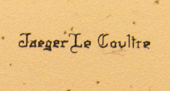 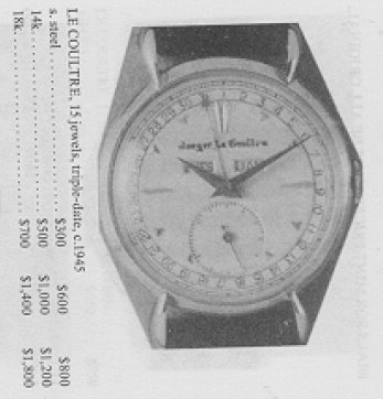 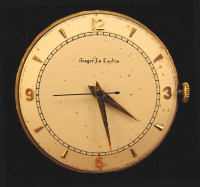  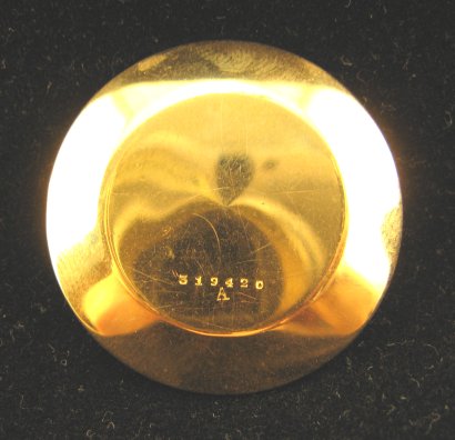 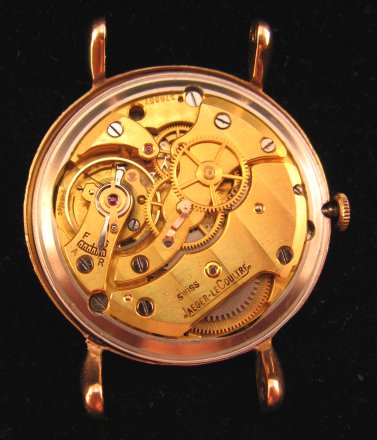 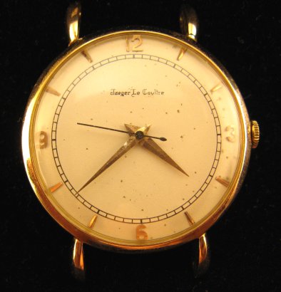 | ||
Gregb New member Username: Gregb Post Number: 29 Registered: 10-2006 Rating: N/A |
Because there are a limited number of dial refinishers operating, you'll often see the same bad refinish job replicated across a large number of watches. They have a die with this incorrect font that they use over and over again to produce a mountain of ugly dials. The Shugart/Engle/Gilbert book shows many watches with refinished dials (some quite bad), so I certainly wouldn't use this as my yardstick for establishing dial originality. Greg |